We all have our favorite team, and with that come team colors. Some of us are lucky enough to have teams who's color scheme is cool; the black and silver of thee Raiders has always made for cool hats and shirts.
Others among us are not similarly blessed; The Vikings purple and yellow comes to mind. As with the difference with team colors, Helmets fall into a wide range of designs.
Some are simple; the Packers and Bears sport a single letter; The 'Niners and Giants have a couple of them. The Eagles, Cardinals, and Ravens have Birds.
But what if we decided to spice things up a bit? What if the NFL took a page out of so many College football books and made the helmet design... more visually stimulating? Below, you will see 4 helmets for each NFL Team. #1 will be the helmet as it appears today, and 2-4 are all separate concept helmets for that them, thanks to Sportsdrop.com.
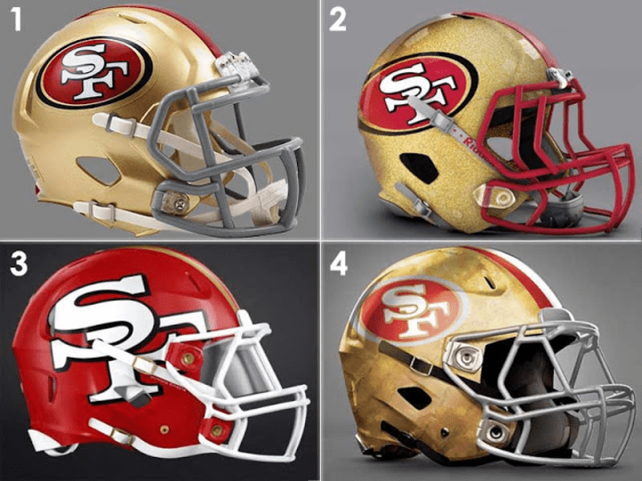
San Francisco 49ers
So the 'Niners are one of those teams who haven't changed their helmet in forever. Joe Montana looks very similar out there to Jimmy G; not, of course, that I'm comparing the two. 2 of the 3 designs up there are all but the same thing, but number 3 is cool. Cool enough to change the classic SF? Probably not.
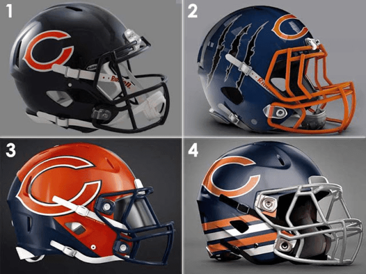
Chicago Bears
I'm a cheesehead, so my first tendency is to make fun of anything Bears. And #'s 2 and 3 give me every opportunity to do so. But even I have to admit... #2 is bad ass.
Cincinnati Bengals
I've always thought the Bengals had one of the better helmet designs in the NFL. A far cry from the boring @ss design they wore when I was a kid... it literally just said "Bengals."
It looked high school as hell; google it. 2 and 3 up there are interesting, but what is #4? Is that a tire track? Did someone run over a Bengal?
Buffalo Bills
The Bills are another team that sports a well designed helmet. Although I will say this... when I think of Buffalo Bill I don't think the frozen shores of New York. So there wasn't much real need for change, which is good. The three up there are not a step up from what works.
Denver Broncos
Maybe I'm old school, but I liked the old Broncos helmet.
But #2 up there is absolutely brilliant. You think Denver, you think mountains... and this, to me, is almost a work of football art.
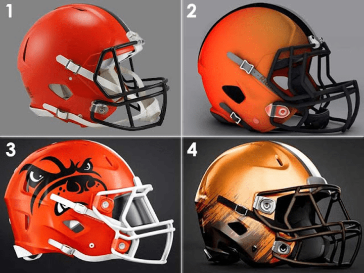
Cleveland Browns
This is a team named after a color. A boring color at that. Yeah, I know they're names after a person. But for a lot of years, this has been the most boring helmet in the NFL. It's.... brown. #2 and #3 are also... brown. But #3... I like it. It harkens back to the Dawg Pound... Google that too.
Tampa Bay Buccaneers
I think pewter power sucks. I absolutely loved the old 'Bucks helmet. Look at this thing!
None of these really work for me, though... It seems you need pewter for pewter power. Just go back to the old ones!
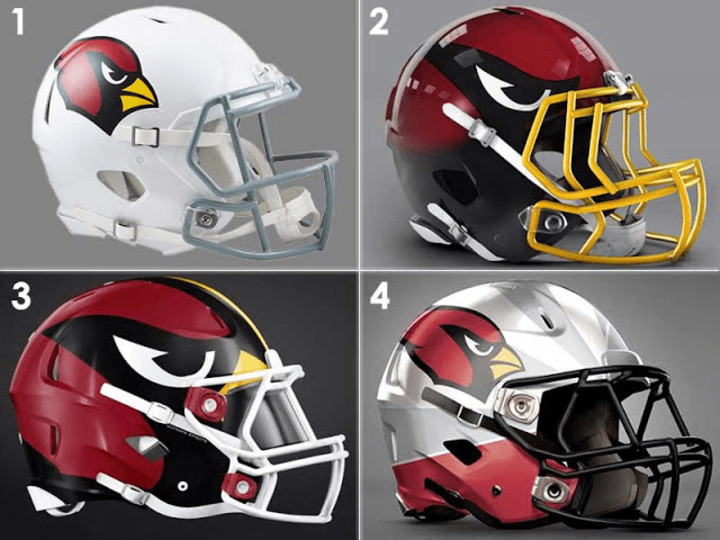
Arizona Cardinals
The Cards' helmet hasn't changed in like 100 years, but it hasn't needed to. I don't mind any of these, but #3 would be a lot better with a matching red or black mask.
Los Angeles Chargers
So I'm actually torn here. # 2.... with all of the lightning... is absolutely bad @ss. But I also like #3. It bucks tradition, but it's a great design.
Kansas City Chiefs
The Chiefs are another that hasn't changed in forever. And another that hasn't needed to, although I have a feeling after the "used to be the 'Skins" they may need a new one before long. But not any of these, although the last one with the red matte isn't bad.
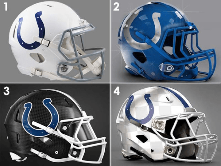
Indianapolis Colts
If you're stuck with just a horseshoe, which i suppose tradition dictates again here... I mean, Johnny U. With those parameters, I do like #3, but then you lose that all white look they've been running.
Dallas Cowboys
In that recurring pattern, Tradition. I hate the Cowboys, but that stupid star might be the most iconic emblem this side of the NFL shield. The flag on #4 is a good look, though.
Miami Dolphins
The Dolphins are one of the teams I think already got it right; these are all terrible, especially #3. That one doesn't even look like a damn Dolphin.
Philadelphia Eagles
Not something I realized before seeing these, but the Iggles are good with that they've got. The first one has scales, the second is awful and the third is just an Oregon Ducks rip off. Fly as you are.
Atlanta Falcons
In my opinion the Dirty Birds already have the best helmet logo in the NFL. #s 2 and #3 are just awful. #3 isn't bad, but the Falcons look better in black.
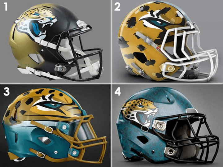
Jacksonville Jaguars
I've always hated the Jags helmet; especially when they did the blending colors thing. I absolutely love #2 and #3.
New York Jets
#2 and #4 are just old helmet designs, really, but #2 is my favorite so far along with that Broncos mountain helmet. It's the background that does it for me, not the logo. This one is so good they should actually change. Like today.
Detroit Lions
The Lions also don't have a lot of leeway... which we can see by the fact that #2 and #4 aren't much of a variation. But #3 really works... imagine it with a uniform the same color.
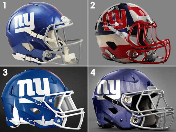
New York Giants
Not a fan of the old school NY they use now. I always liked this one.
The image of the skyline is amazing. Imagine #3 with the Giants logo.
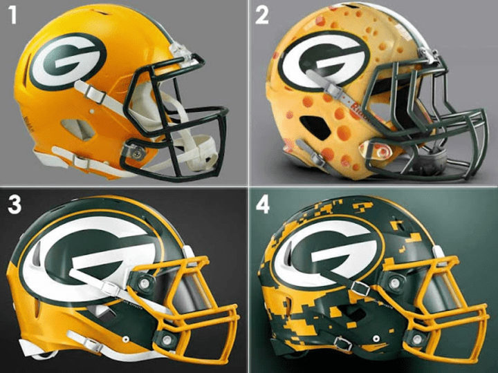
Green Bay Packers
As a cheesehead, I have debated many times the subject of whether we should change our helmet. I'm still stuck on maybe. But not to any of these. The cheese one is hilarious but awful.
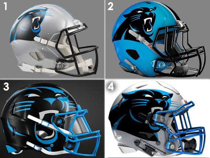
Carolina Panthers
I've always thought the Panthers could do more with that logo, but never really had an idea what. Then I saw #3.
New England Patriots
I've never been a fan of the Pats' new logo, although if I had to pick a new one the red, white, and blue one ain't bad. I wish they'd go back to these.
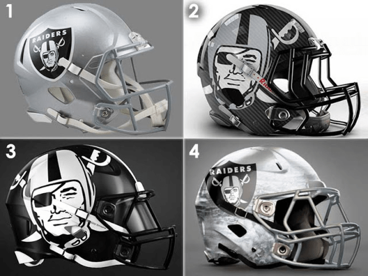
Las Vegas Raiders
I thought the Raiders might pull a uni change of some kind heading into Vegas; I'm not sure how Raiders fans feel about this whole thing. But what I do know? #3 is every bit as bad @ss as classic Raiders helmets.
Los Angeles Rams
Since they're stuck on the horns, I guess #4 ain't bad. I kind of miss the old color scheme with the bright yellow.
Baltimore Ravens
I hate the Ravens. Have since Cleveland got screwed all those years ago. I know that was like 50 years ago, but old habits die hard. That might be part or the reason I hate the bird, but I do. #3 is cool, but... What do I know? I do know #4 is awful.
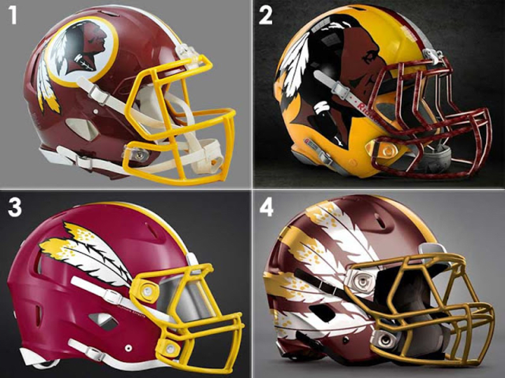
Washington Nameless
I realize this is irrelevant now, but thought I'd throw it in.
New Orleans Saints
The classic Fleur de li (no idea if that's how it's spelled, but spell check cleared it.) is perfect for the old Saints. This model... Kamara, Thomas... more attitude. I think #2 would be perfect. #4 is kind of amazing as well.
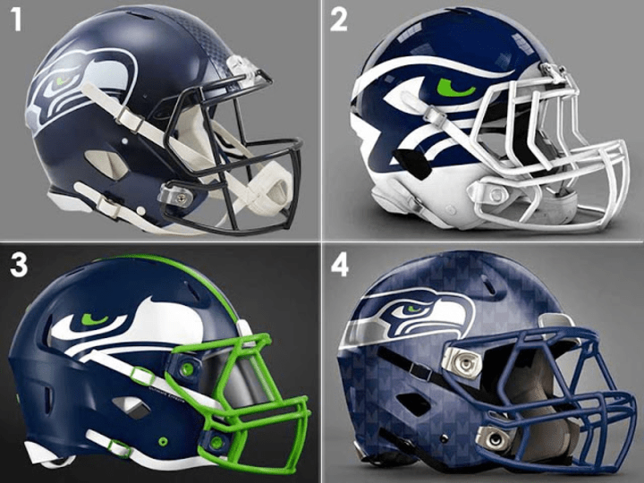
Seattle Seahawks
It occurs to me as I write this that I have no idea what a Seahawk actually is. Do they look like that? I don't think I've ever considered them changing. I wish they wouldn't... then I'd have to learn what one actually looks like. I hate #3. #4 makes me think of old USFL helmets.
Pittsburgh Steelers
You'd have to find an amazing design to warrant changing that iconic steel city design. #2 does, I think. It catches the nuance. I can totally see Jack Lambert in that.
Houston Texans
I'm not even sure what the logo is. I get it's a bull, but is there some symbolism? I just think it's unpleasant on the eye. Oblong. #4 would be a step up.
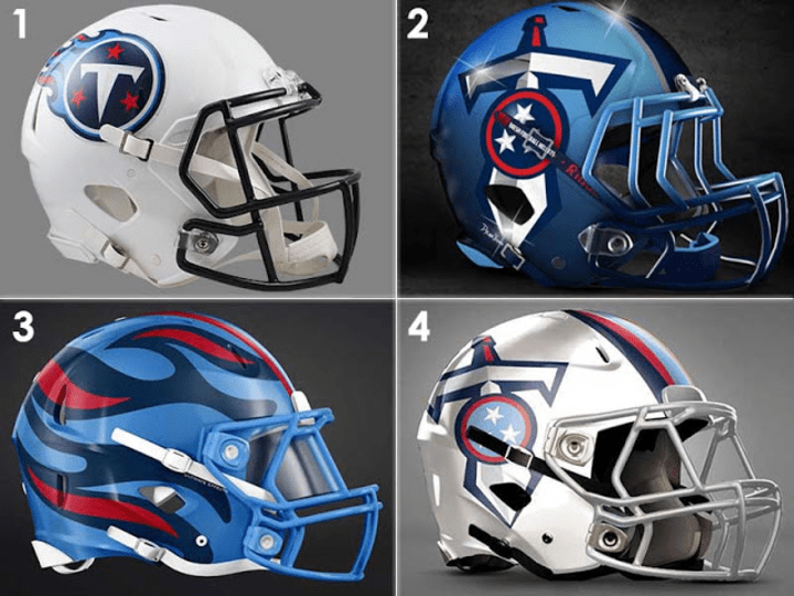
Tennessee Titans
I've seen that sword logo before, and it sucks. It's cartoony. And the current one... it doesn't suck, but how does it represent a Titan? If anything it looks like a meteor. A silhouette of the Parthenon would be cool. Or something at least mythology based. An image. This just makes me miss the Oilers.
That was just an amazing damn football helmet.
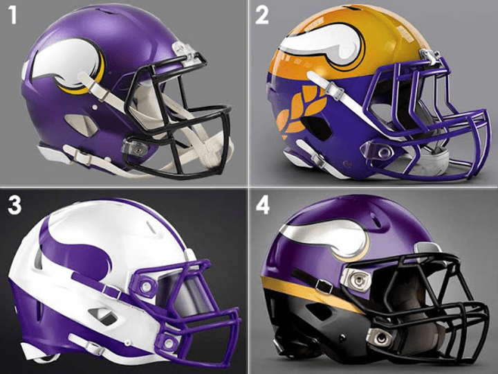
Minnesota Vikings
Much as I dislike the Viqueens, that horn is another one of those iconic helmet images. It would be hard to find one worth considering. None of these would do it.


No comments:
Post a Comment